Elevated Autumn Décor
Jewels of the Forest
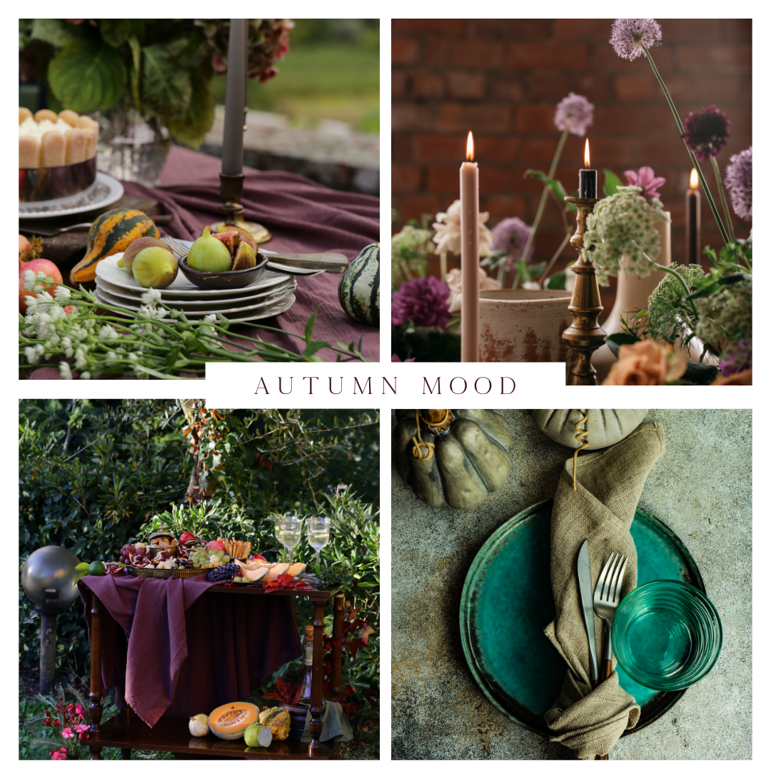
The beauty of these elevated autumn palettes lies in their departure from the typical orange and green hues, instead embracing rich, jewel-toned colours with deep saturation and luxurious textures. This curated approach to autumn décor still captures the essence of the season but does so with a dramatic, refined twist that feels both unexpected and opulent.

In the images, we see how tones like plum, deep burgundy, forest green, and teal create a moody, atmospheric setting. These analogous colours sit close to one another on the colour wheel, which maintains the warmth and harmony we associate with autumn, but the use of varied saturation levels brings depth and dimension to the palette. For example, the contrast between the soft, matte finishes of the table linens and the richness of the velvet and satin textures elevates the tactile experience, making the space feel more luxurious.
The subdued lighting and gold accents further enhance this effect, with candlelight reflecting off metallic surfaces and casting a warm glow across the scene. This layering of textures—soft, organic fabrics alongside sleek, polished elements—creates a sophisticated, multisensory environment that invites you in. The inclusion of organic elements like figs, gourds, and greenery adds a natural yet artfully composed touch, grounding the elegance with the earthiness of the season.
Ultimately, what makes this palette so successful is its ability to evoke the essence of autumn—cosiness, richness, and warmth—while avoiding the predictable clichés. The combination of luxurious tones and textures transforms a seasonal space into one that feels as special as it is timeless.
Autumn Glow
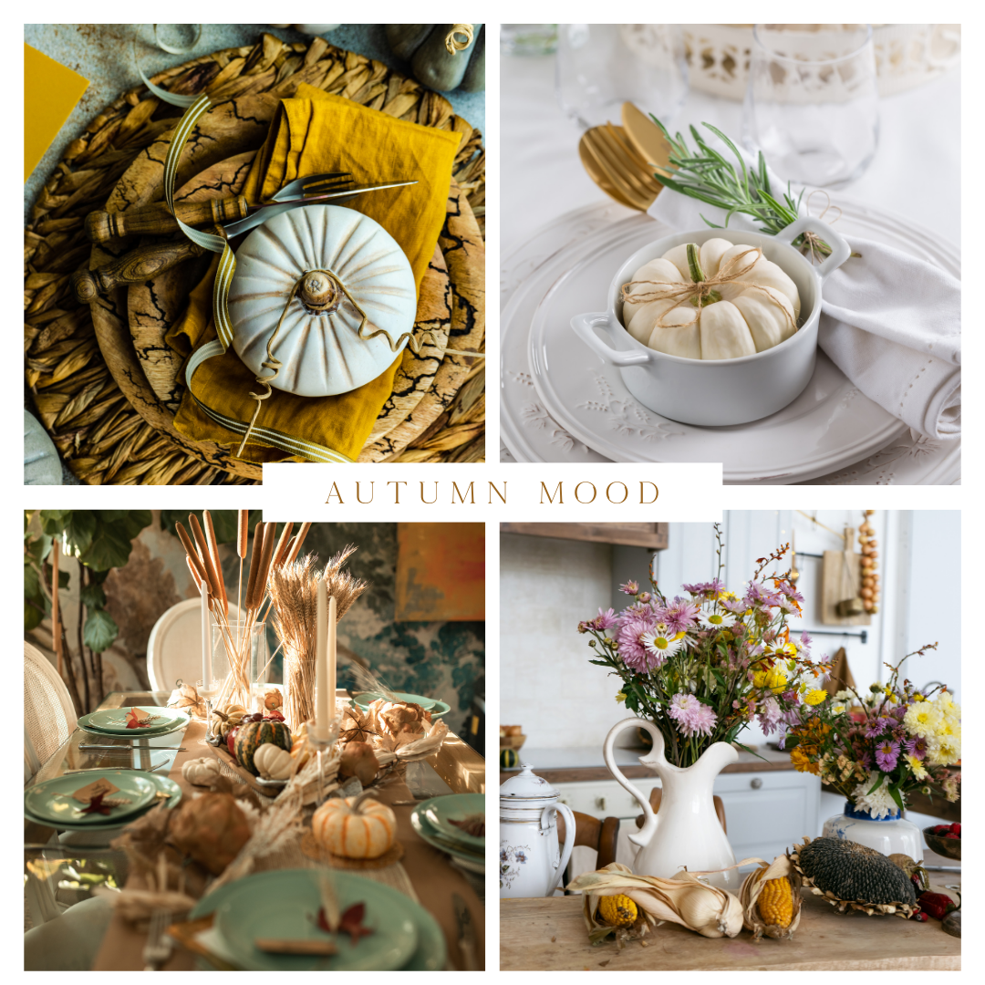
These autumn palettes take a softer, more understated approach to seasonal décor, proving that subtlety can be just as impactful as bold colour schemes. By focusing on muted, neutral tones like sage green, soft beige, and creamy whites, these settings evoke a serene, organic feel while still embodying the warmth of autumn.

The layering of earthy textures—like woven placemats, linen napkins, and dried wheat arrangements—brings depth and tactile richness to these vignettes. The low saturation of the colours works beautifully with these natural textures, creating a cohesive design that feels elegant without overwhelming the senses. Soft, matte pumpkins in cream or pale green serve as the focal points, adding just the right amount of visual interest while maintaining a calming, cohesive look.
In terms of tone, the gentle contrast between warm wood and cool whites offers balance, while golden accents provide a subtle nod to traditional autumn hues without veering into cliché. The warmth in the mustard-coloured napkin or the gold-rimmed cutlery keeps the overall palette from feeling too cool, ensuring that the space still feels inviting and seasonal.
As with the previous palette, these choices elevate the traditional autumn colours into something more refined. Instead of relying on the intensity of typical oranges and reds, this scheme focuses on calm, subdued beauty, letting texture and form do the heavy lifting. The result is a space that feels fresh and modern but still rooted in the organic, grounding essence of the season. By playing with tone, texture, and muted color, this version of autumn décor provides an elegant yet approachable alternative to the usual vibrant displays.
